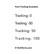
Tracking
Font tracking is a typography setting that defines the horizontal distance between each character. Most typefaces (besides cursive ones) have a natural padding on the sides of each character. The tracking setting adjusts this padding to be smaller or larger.
A negative tracking setting can be used to fit more text in a specific area without reducing the font size. Negative tracking allows more letters and numbers to be crammed into the same amount of horizontal space. If the tracking setting is too low, however, the text may become difficult to read. If it is reduced enough, the characters may overlap.
A positive tracking setting can help make text more readable. It may also be used for logos or other prominent text, since a high tracking setting makes text stand out more. However, if the font tracking is too high, the text can actually become more difficult to read and spaces between words may be difficult to discern.
Tracking vs Kerning
Kerning is similar to tracking, but refers to spacing between specific letters. Kerning allows certain letters to fit more closely without overlapping. A good example is "AV," in which kerning enables the lower part of the A to fit underneath the top part of the V. Tracking does not consider individual character shapes, but simply adds uniform spacing between each character.
NOTE: "Tracking speed" is unrelated to font tracking and describes the rate at which a mouse or trackpad moves the cursor. A high tracking speed will make the cursor move further with less mouse movement or trackpad input.
 Test Your Knowledge